Metrics
The Discover Metrics page in OpenSearch UI provides a dedicated interface for discovering, querying, and visualizing time-series metric data. This page is optimized for working with Prometheus metrics using PromQL.
The Discover Metrics page is available in Observability workspaces. To access it, navigate to an Observability workspace, expand Discover in the left navigation, and select Metrics.
Configuring a Prometheus data source
Before you start, configure a Prometheus data source using one of the following methods:
-
Creating an Amazon Managed Service for Prometheus data source in the AWS Management Console
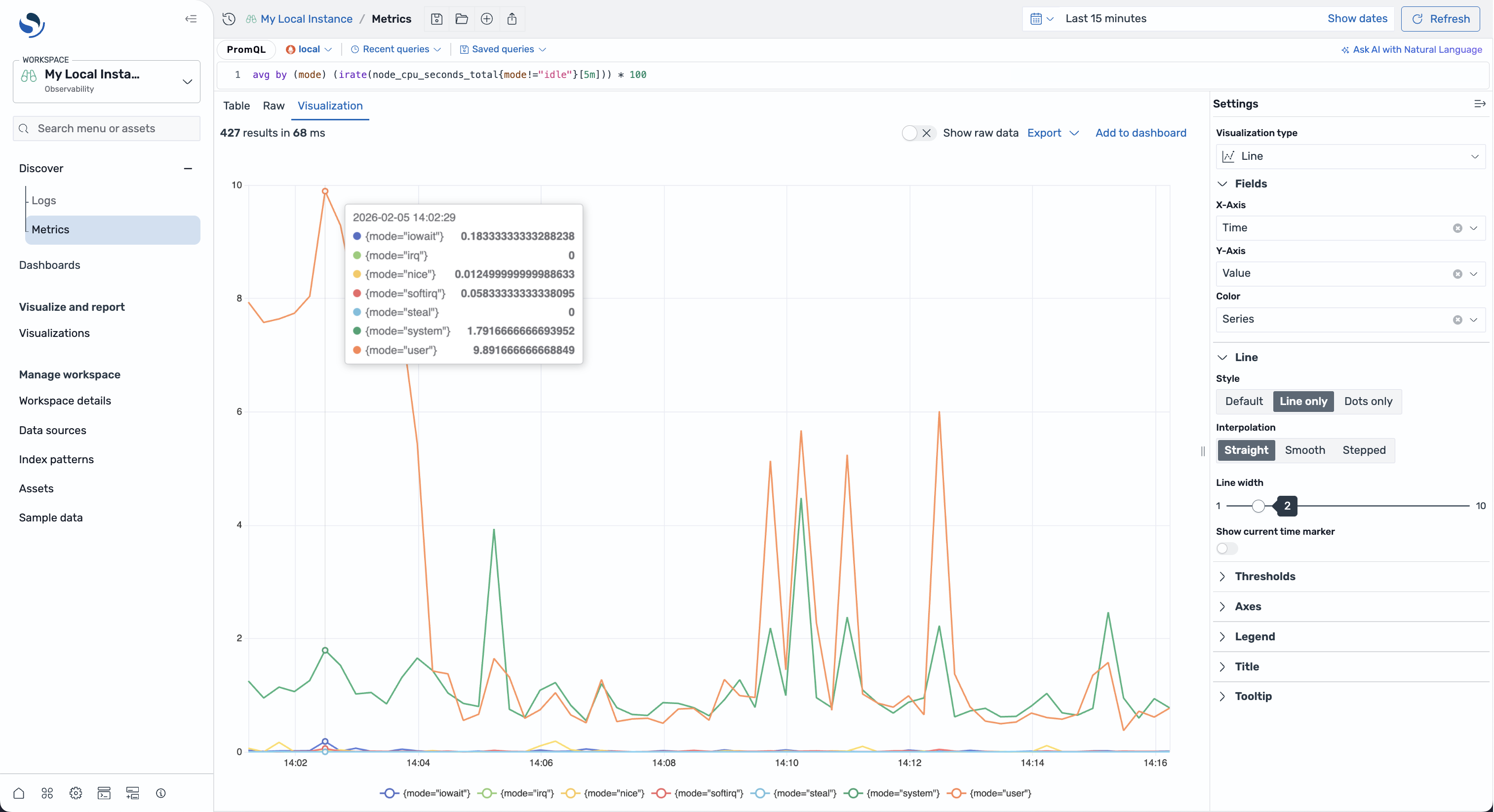
Query panel
You can write and run metric queries in the query panel at the top of the Discover Metrics page. The query editor provides autocomplete suggestions and syntax highlighting for PromQL.
Writing queries
Write queries using PromQL syntax. For example:
up{job="prometheus"}
Running queries
To run a query, enter your query in the query editor and select Refresh.
You can run multiple PromQL queries together by separating them with a semicolon (;):
up{job="prometheus"};
node_cpu_seconds_total{mode="idle"};
Each query runs independently, and the results are combined in the output.
Time filter
Use the time filter to specify the time range for your metric data:
-
Quick select – Choose a relative time range (for example, the last 15 minutes or the last 1 hour).
-
Commonly used – Select from predefined time ranges.
-
Custom – Specify absolute start and end times.
-
Auto-refresh – Set an automatic refresh interval.
Viewing results
After running a query, the results are displayed in a tabbed interface:
-
Metrics – Displays the latest data point for each series in a table format.
-
Raw – Shows the latest data point for each series as raw JSON returned by the data source.
-
Visualization – Provides interactive charts for your metric data.
Configuring visualizations
When the Visualization tab is selected, a settings panel appears on the right side of the screen. Use this panel to:
-
Select a chart type – Choose from line, bar, pie, gauge, or table visualizations.
-
Map axes – Assign fields to the X and Y axes.
-
Customize styles – Adjust colors, legends, gridlines, and other visual options.
When you modify the settings, the visualization is updated automatically.
