Discover Logs
The Discover Logs page provides a dedicated interface for exploring and analyzing log data in your OpenSearch Service observability workspace. You can write PPL queries to filter and aggregate log data, create visualizations directly from query results, and add those visualizations to dashboards. The page also provides natural language query assistance powered by the OpenSearch AI assistant.
To access the Logs page
In your observability workspace, expand Discover in the left navigation and choose Logs.
Exploring log data
The Discover Logs interface provides the following components for exploring your log data.
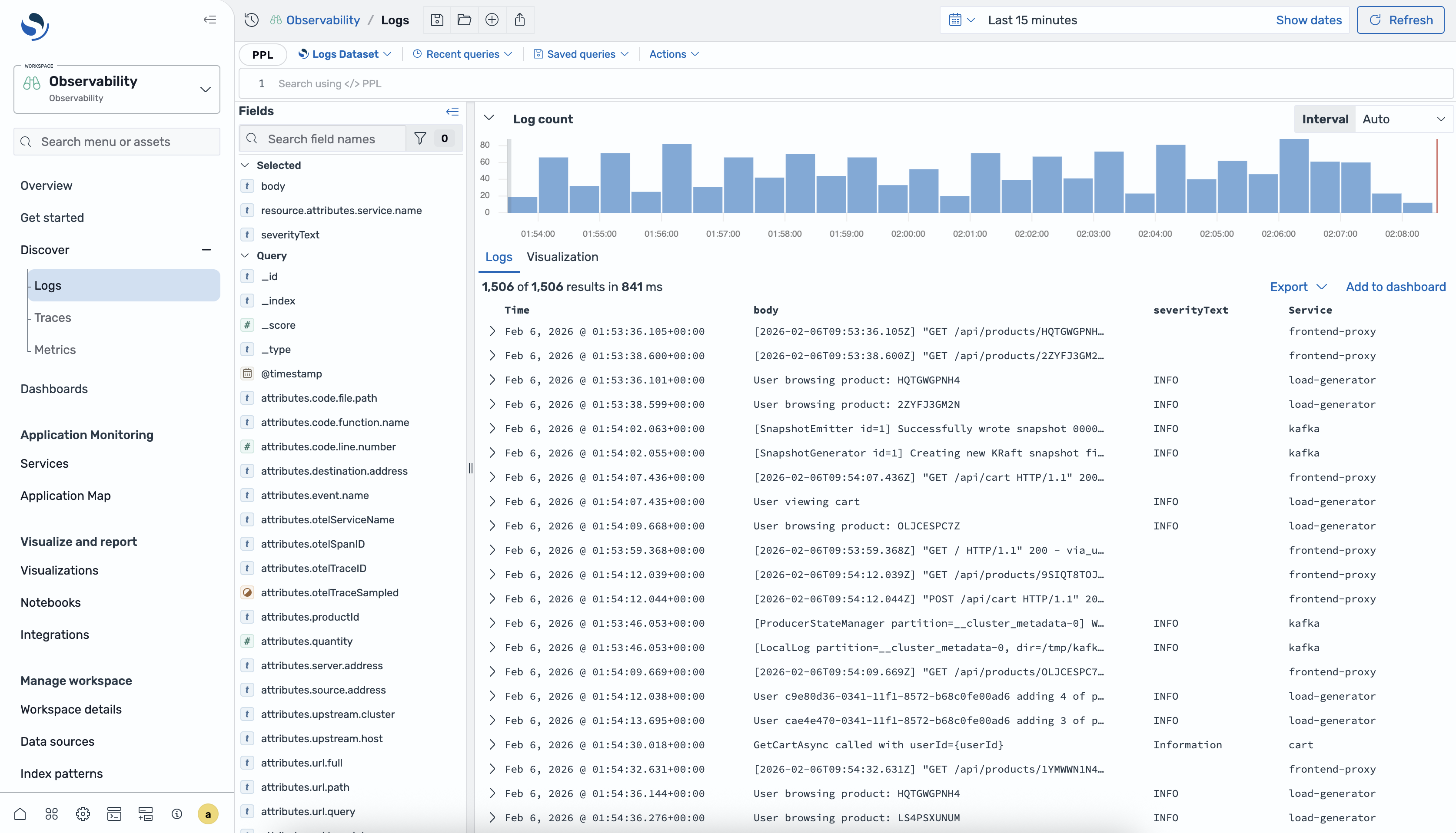
-
Dataset selector – Choose the logs dataset that you want to query. Each dataset maps to one or more indexes in your OpenSearch Service domain.
-
Query editor – Write PPL queries to filter, aggregate, and transform your log data. The editor provides autocomplete suggestions and syntax highlighting.
-
Time filter – Specify the time range for your query results. You can choose a relative range or specify absolute start and end times.
-
Results panel – View query results as a table of log events. You can expand individual events to see all fields.
-
Histogram – View the distribution of log events over time. The histogram updates automatically based on your query and time filter.
-
Fields panel – Browse available fields in your dataset and add them as columns to the results table.
Querying logs using PPL
Piped processing language (PPL) is a query language that uses pipe-based (|)
syntax for chaining commands. You can use PPL to filter, aggregate, and transform your
log data.
Basic queries
To retrieve all log events from a dataset, use the source command:
source = my-logs-datasetTo limit the number of results, use the head command:
source = my-logs-dataset | head 20Filtering with WHERE
Use the where clause to filter log events based on field values:
source = my-logs-dataset | where severity_text = 'ERROR'You can combine multiple conditions:
source = my-logs-dataset |
    where severity_text = 'ERROR' and service_name = 'payment-service'
Managing queries
You can save frequently used queries for reuse. To save a query, choose Save in the query editor toolbar and enter a name for the query. To load a saved query, choose Open and select the query from the list.
For the complete list of PPL commands and functions, see the Piped Processing Language reference
Creating visualizations from logs
You can create visualizations directly from your PPL query results. Use the
stats command to aggregate data for visualization:
source = my-logs-dataset |
    stats count() as error_count by service_name, span(timestamp, 1h)
After you run a stats query, choose the Visualization
tab to see the results as a chart.

Visualization types
The following table describes the visualization types that you can use.
| Type | Description |
|---|---|
| Line | Displays data points connected by lines, useful for showing trends over time. |
| Area | Similar to a line chart with the area under the line filled in, useful for showing volume over time. |
| Bar | Displays data as vertical or horizontal bars, useful for comparing values across categories. |
| Metric | Displays a single numeric value, useful for showing key performance indicators. |
| State timeline | Displays state changes over time as colored bands, useful for monitoring status transitions. |
| Heatmap | Displays data as a matrix of colored cells, useful for showing density and patterns. |
| Bar gauge | Displays a single value as a filled bar within a range, useful for showing progress toward a threshold. |
| Pie | Displays data as proportional slices of a circle, useful for showing composition. |

Visualization settings
When the Visualization tab is active, a settings panel appears on the right side of the screen. Use this panel to configure the chart type, map fields to axes, and customize visual styles such as colors and legends.
To switch the axes of a visualization, use the axis configuration in the settings panel.

Adding visualizations to dashboards
After you create a visualization, you can add it to a dashboard for ongoing monitoring. Choose Save to dashboard in the visualization toolbar, then select an existing dashboard or create a new one. The visualization is saved with its underlying PPL query so that it refreshes automatically when you open the dashboard.
